Space Aurora: A Display Font That Elevates Digital Branding
It started with a hero section—just me, a soft gradient background, and the quiet pressure of launching a new coaching website. I’d spent hours refining the headline copy, but something felt off. The clean sans serif I’d defaulted to was legible, yes, but it didn’t carry the warmth or quiet wonder the brand promised. So I opened my font library, scrolled past the usual suspects, and clicked on Space Aurora. Within seconds, I’d swapped in its elegant, playful curves—and suddenly, the whole layout exhaled.
A Typeface That Breathes With Your Brand
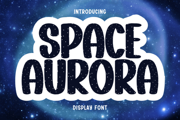
Space Aurora is a premium display font that balances whimsy and sophistication in a way few typefaces do. Its letterforms have gentle tapering strokes, subtle flares, and a delicate rhythm—like starlight traced by hand. It’s not overly ornate, nor is it cold or minimal. Instead, it feels intentional: thoughtful spacing, balanced x-height, and just enough personality to spark recognition without sacrificing clarity. As a web designer, I appreciate how it avoids the pitfalls of many decorative fonts—it doesn’t compete with content; it invites attention *to* it.
How It Performs in Real Web Layouts
I tested Space Aurora across multiple contexts: a boutique online store’s banner, a course sales page’s main headline, a portfolio site’s project titles, and even a subtle accent in a blog post’s pull quote. In every case, it held up beautifully at larger sizes—especially between 36px and 96px—where its elegance truly shines. On mobile, I used clamp(28px, 4vw, 48px) for responsive scaling, and it remained legible and impactful without blurring or crowding. Over light backgrounds? Crisp and airy. Over muted image overlays? Still distinct—thanks to generous letter spacing and strong contrast in its default weight.
Where it truly excels is in establishing visual hierarchy. On a landing page, pairing Space Aurora for the headline with a neutral sans serif like Inter or Poppins for body copy created instant breathing room and clear focus. Users didn’t scroll past—they paused. That pause matters. It signals intentionality, care, and brand confidence—not just in aesthetics, but in UX rhythm.
Smart Pairings & Practical Integration
Space Aurora isn’t meant to carry long paragraphs—or navigation menus, form fields, or micro-interactions. It’s a display font, designed for impact, not endurance. But paired thoughtfully, it becomes a powerful part of your typographic system:
- For hero sections: Use it at 48–72px with generous tracking (80–120 units) to let each character breathe.
- For CTAs and buttons: Reserve it for primary action headlines only—not the button label itself—unless the button is large, centered, and isolated (e.g., a “Start Your Journey” banner).
- For digital brand kits: It works beautifully as a logo lockup alternative or as a stylized wordmark overlay in social media banners and email headers.
- For accessibility-aware design: Always pair it with a WCAG-compliant sans serif for all functional text, and never rely on it alone for critical information.
I also checked its webfont support—Space Aurora includes WOFF2 files, which load quickly and compress well. No render delays, no FOIT flashes in Chrome or Safari during testing. Bonus: it supports Latin-1 and basic multilingual characters, making it viable for bilingual landing pages where display text appears in English and Spanish, for example.
What to Check Before You Deploy
Before dropping Space Aurora into a client site or live shop, I always verify three things: First, the license explicitly permits web embedding (not just desktop use). Second, whether stylistic alternates or ligatures are included—if you’re using it for a logo or branded headline, those flourishes can add polish. Third, file size: at under 45KB for the full WOFF2 set, it won’t bloat your site’s performance metrics.
Also worth noting: while Space Aurora includes one refined weight (ideal for display), it doesn’t offer bold or italic variants. That’s fine—it’s not meant for emphasis within paragraphs. But it does mean you’ll want a robust secondary font family with at least three weights (light, regular, medium) to handle supporting text gracefully.
When Less Is Truly More
There are moments where Space Aurora shouldn’t be used—and recognizing them is part of using it well. Avoid it in:
- Small navigation labels (<14px)
- Form input placeholders or error messages
- Dense dashboard interfaces or data tables
- Any context requiring rapid scanning of technical or time-sensitive info
It’s also not ideal for animated text reveals unless carefully timed—the delicate shapes can feel fragile in fast motion. But for static, high-impact moments? It transforms tone instantly. A wellness brand’s “You Belong Here” headline became grounded and serene. A creative studio’s “Build With Wonder” tagline felt both aspirational and human.
In the end, Space Aurora isn’t just another display font. It’s a quiet collaborator—one that asks you to slow down, choose deliberately, and trust that elegance doesn’t need volume to resonate. For web designers who believe typography is among the most honest expressions of brand voice, it’s a rare find: distinctive, usable, and deeply respectful of the people who read it.